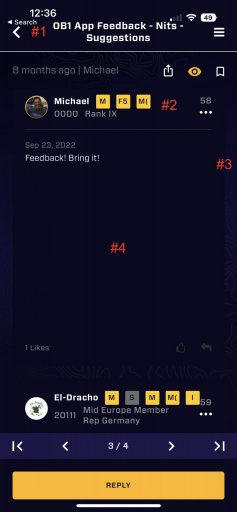
Benefactor
- 15,584
- First Name
- Michael
- Last Name
- Murguia
- Member #
0000
- Ham/GMRS Callsign
- KM6YSL
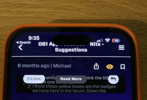
Hi John - here are a couple ways to search for a user in OB1 - it also works for Member Number. Please let me know if you find this not to be working - or if we can improve the features to be easier. Also - can you let me know a member that did not show up so I can diagnose?Hi Michael,
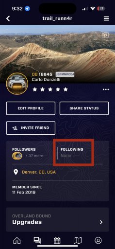
When performing a search in messaging section, I noticed some of the members are not showing up in the search results. Also, over the last few years I have directed folks to reach out to me on the OB app by looking up my OB ID. I realize now that I have not received very many responses. Could this be due to an issue with the search function (or do folks just think I'm weird and are avoiding me lol)?
Thank you!
M
View attachment Image from iOS.mov