

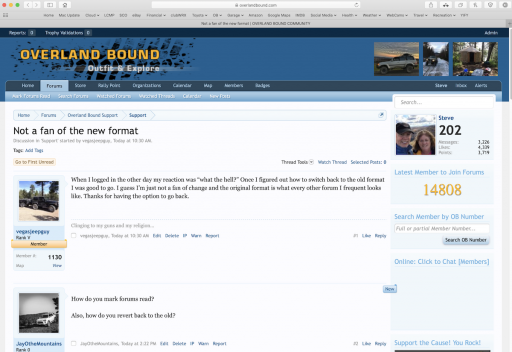
When I logged in the other day my reaction was “what the hell?” Once I figured out how to switch back to the old format I was good to go. I guess I’m just not a fan of change and the original format is what every other forum I frequent looks like. Thanks for having the option to go back.
Not a fan of the new format
- Thread starter vegasjeepguy
- Start date


Member III
- 2,827
- First Name
- Tom
- Last Name
- Houston
- Member #
-
8300
- Ham/GMRS Callsign
- WØNUT Extra
Don't particularly like it. How do you find the latest posts? Getting down to your alerts is a couple of steps.
I went back to the old format.
I went back to the old format.
Old formatHow do you mark forums read?
Also, how do you revert back to the old?
@Michael
I've noticed that since the upgrade the Icon on Firefox and Chrome for my Pinned page is no longer the OB logo but a Blue logo that says xenForo.
The Dropdowns on the Top Menu bar often popup too quickly and then seem to get stuck down. IE if an errant mouse move crosses them one sticks down in the way of the top post.
Small potatoes but wanted you to know.
@JayOtheMountains
How do you mark forums read?
Also, how do you revert back to the old?
@old_man
How do you find the latest posts?
Getting down to your alerts is a couple of steps.
Boort
I've noticed that since the upgrade the Icon on Firefox and Chrome for my Pinned page is no longer the OB logo but a Blue logo that says xenForo.
The Dropdowns on the Top Menu bar often popup too quickly and then seem to get stuck down. IE if an errant mouse move crosses them one sticks down in the way of the top post.
Small potatoes but wanted you to know.
@JayOtheMountains
How do you mark forums read?
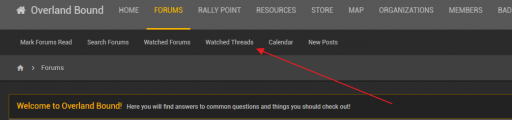
Hover over the Top Menu bar / FORUMS
Select "Mark Forums Read" from drop down
Sometimes in various views there will also be a "Mark Forums Read" option above the listed postings just to the left of the yellow box with your Avatar, Name and OB #Also, how do you revert back to the old?
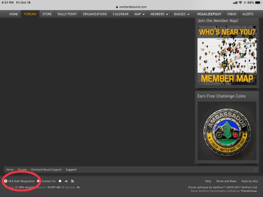
Scroll tot eh bottom footer of any page on the left side of the footer find the box that reads "OLB Dark Responsive Official" Click it A popup will appear with 3 choices "OLB Dark Responsive" switches back to the old theme.
@old_man
How do you find the latest posts?
Hover over the Top Menu bar / FORUMS
Select "New Posts" from drop down
Getting down to your alerts is a couple of steps.
I too share this concern and have not found a better way w/o 3 clicks to read the alerts.
Boort

Traveler III
I'm still on good old "Default Style" with the white background. Easy to read, and all the menu options are easy to find. If that style ever goes away, I'm done, as I can't read on a dark background with white text. Gives me a headache in just a few minutes.

Enthusiast III

Influencer II
I like it, just think about the people that use mobile devices, I'm almost never online with a computer about 98% mobile Android device and this design is so much better than the old one!
Didn't check it out on the computer but will do, on a big screen I prefer a light background with black letters to.
Didn't check it out on the computer but will do, on a big screen I prefer a light background with black letters to.

Benefactor
- 15,584
- First Name
- Michael
- Last Name
- Murguia
- Member #
-
0000
- Ham/GMRS Callsign
- KM6YSL
Any specific feedback? Any helps. Thanks!Big step backwards. I understand the desire to have a "responsive theme" that works across platforms, but that one is terrible. Back to using the old "OLB Dark Responsive" for me.
M
Benefactor
- 15,584
- First Name
- Michael
- Last Name
- Murguia
- Member #
-
0000
- Ham/GMRS Callsign
- KM6YSL
Any specific feedback? Features missing etc? Thanks!When I logged in the other day my reaction was “what the hell?” Once I figured out how to switch back to the old format I was good to go. I guess I’m just not a fan of change and the original format is what every other forum I frequent looks like. Thanks for having the option to go back.
M
Benefactor
- 15,584
- First Name
- Michael
- Last Name
- Murguia
- Member #
-
0000
- Ham/GMRS Callsign
- KM6YSL
What are the "secret menus"? Thanks!It is cleaner, but it is harder to find options, there are now secret menus you have to find your way to...
M
Benefactor
- 15,584
- First Name
- Michael
- Last Name
- Murguia
- Member #
-
0000
- Ham/GMRS Callsign
- KM6YSL
I re-added the menu sub-links. These:It is cleaner, but it is harder to find options, there are now secret menus you have to find your way to...
Does that help? Is there something else?
Thanks!
M
Benefactor
- 15,584
- First Name
- Michael
- Last Name
- Murguia
- Member #
-
0000
- Ham/GMRS Callsign
- KM6YSL
Thanks for the response on this @BoortHow do you mark forums read?
Also, how do you revert back to the old?
I also added the "sub-menus" that were turned off. I think that resolves a number of issues. Please let me know what else you are missing/need.
Benefactor
- 15,584
- First Name
- Michael
- Last Name
- Murguia
- Member #
-
0000
- Ham/GMRS Callsign
- KM6YSL
Hi all - first off, THANK YOU for taking the time to provide feedback. These are your forums, and I want to make them as easy to use as possible. Its an ongoing process.
In this case - not only do we need to update for responsive reasons, but we are incorporating "platform features" which do not work with the old design. I do not want to sacrifice function for form however - so please provide as much feedback (it needs to be very specific) as you have time for and I will address the issues.
"It sux" doesn't help, but the feedback regarding the "Sub-Menus" was actionable, and now fixed.
Steve - once we work through functional feedback - we will likely work up a light version of this theme. First, I want to address functional concerns.
Thanks guys - looking forward to more!
M
Benefactor
- 15,584
- First Name
- Michael
- Last Name
- Murguia
- Member #
-
0000
- Ham/GMRS Callsign
- KM6YSL
Hi Boort, thank you for the detailed responses. For the dropdown menus - I changed the dropdown response from 0ms to 100ms which provides a barely perceptible delay - which might help. On the "getting stuck down" I'm looking further into this. Thanks!@Michael
I've noticed that since the upgrade the Icon on Firefox and Chrome for my Pinned page is no longer the OB logo but a Blue logo that says xenForo.
The Dropdowns on the Top Menu bar often popup too quickly and then seem to get stuck down. IE if an errant mouse move crosses them one sticks down in the way of the top post.
Small potatoes but wanted you to know.
@JayOtheMountains
How do you mark forums read?
Hover over the Top Menu bar / FORUMS
Select "Mark Forums Read" from drop downSometimes in various views there will also be a "Mark Forums Read" option above the listed postings just to the left of the yellow box with your Avatar, Name and OB #
Also, how do you revert back to the old?
Scroll tot eh bottom footer of any page on the left side of the footer find the box that reads "OLB Dark Responsive Official" Click it A popup will appear with 3 choices "OLB Dark Responsive" switches back to the old theme.
@old_man
How do you find the latest posts?
Hover over the Top Menu bar / FORUMS
Select "New Posts" from drop down
Getting down to your alerts is a couple of steps.
I too share this concern and have not found a better way w/o 3 clicks to read the alerts.
Boort
M
Traveler III
Comparing the new format to the light "Default Style" (since I've never used toe old dark style) :so please provide as much feedback (it needs to be very specific) as you have time for and I will address the issues.
Center column is narrower, with the right column being wider.
Less information in a given height window.
- Each element has a "frame" around it that takes up height.
- Post time, hit buttons, post number, like, reply used to be on the same line. Now they take up 2 (yea, little things...)
- Left column stuff is taller, so even a short post takes up height to fit all the profile stuff in.
- The header is taller without the photo than the old one with (Much larger text in the menus taking full width of window instead of half, lots of extra space around text)
The user menu, inbox, and alerts seem to be missing.
Sigs with images require expanding to see.
Serif text is much easier to read than san serif. Whatever font is used seems heavier and less elegant.
Frankly, I likely wouldn't use a light version of this style, even if it were available. I'd still use the default. Open my screen shot above in a new window and look at it next to the new design. One looks like a well thought out and elegant design, and the other looks like a generic dark themed template.
Respectfully,
Steve
Benefactor
- 15,584
- First Name
- Michael
- Last Name
- Murguia
- Member #
-
0000
- Ham/GMRS Callsign
- KM6YSL
Thank you Steve - I'll parse through this - FYI I am also working up the "OLB Light Official" so there will be a light version that is "feature complete" and supported. I'd be glad to have your feedback on that too - thought that is not really ready for prime time, you can take a look.Comparing the new format to the light "Default Style" (since I've never used toe old dark style) :
Center column is narrower, with the right column being wider.
Less information in a given height window.
- Each element has a "frame" around it that takes up height.
- Post time, hit buttons, post number, like, reply used to be on the same line. Now they take up 2 (yea, little things...)
- Left column stuff is taller, so even a short post takes up height to fit all the profile stuff in.
- The header is taller without the photo than the old one with (Much larger text in the menus taking full width of window instead of half, lots of extra space around text)
The user menu, inbox, and alerts seem to be missing.
Sigs with images require expanding to see.
Serif text is much easier to read than san serif. Whatever font is used seems heavier and less elegant.
Frankly, I likely wouldn't use a light version of this style, even if it were available. I'd still use the default. Open my screen shot above in a new window and look at it next to the new design. One looks like a well thought out and elegant design, and the other looks like a generic dark themed template.
Respectfully,
Steve
M
Benefactor
- 15,584
- First Name
- Michael
- Last Name
- Murguia
- Member #
-
0000
- Ham/GMRS Callsign
- KM6YSL
Hey Steve - some adjustment:Comparing the new format to the light "Default Style" (since I've never used toe old dark style) :
Center column is narrower, with the right column being wider.
Less information in a given height window.
- Each element has a "frame" around it that takes up height.
- Post time, hit buttons, post number, like, reply used to be on the same line. Now they take up 2 (yea, little things...)
- Left column stuff is taller, so even a short post takes up height to fit all the profile stuff in.
- The header is taller without the photo than the old one with (Much larger text in the menus taking full width of window instead of half, lots of extra space around text)
The user menu, inbox, and alerts seem to be missing.
Sigs with images require expanding to see.
Serif text is much easier to read than san serif. Whatever font is used seems heavier and less elegant.
Frankly, I likely wouldn't use a light version of this style, even if it were available. I'd still use the default. Open my screen shot above in a new window and look at it next to the new design. One looks like a well thought out and elegant design, and the other looks like a generic dark themed template.
Respectfully,
Steve
- Reduced the size of the sidebar to 250px (same as default)
- Reduced "gutter" between elements (could reduce further or eliminate, but I like the separation. Also note - sidebar can be collapsed completely.
- Post time/hit/etc. OK noted.
- "more space" OK - I'll look at that and see if it can be tightened.
Not really. The purpose of my post was to express gratitude that I am able to go back to what’s familiar and comfortable. Since I primarily use an iPad to surf the forum I’m not too concerned about a more mobile friendly format and I find an iPhone 5 too small of a screen to learn a new format.Any specific feedback? Features missing etc? Thanks!
M