
Benefactor
- 15,584
- First Name
- Michael
- Last Name
- Murguia
- Member #
-
0000
- Ham/GMRS Callsign
- KM6YSL
I will posit the current map tabs functionality are confusing and information is cluttered. We are therefore beating up various alternatives. Here is a version of the map tabs I'll put forth to tear apart and get new ideas.
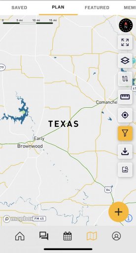
These tabs are the subject:
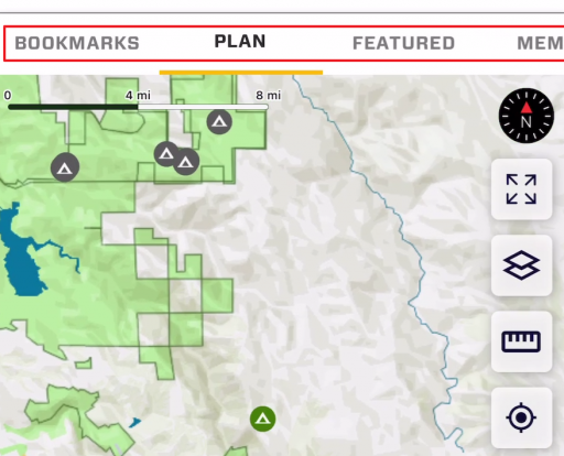
...and this is said clutter:
This proposal is an attempt to provide information where you need it, make it less confusing, and declutter for basic map use. Proposed new tabs:
Would love to get your feedback or other ideas. Is this a fail? Does it sound good?
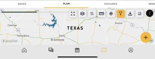
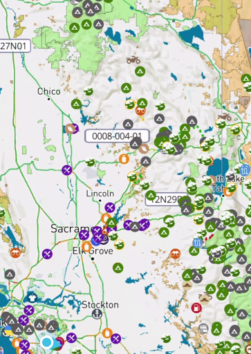
These tabs are the subject:
...and this is said clutter:
This proposal is an attempt to provide information where you need it, make it less confusing, and declutter for basic map use. Proposed new tabs:
- Main Map: This is where users land by default. No POI are visible on this map when you first see it at a low zoom, but they are there when you zoom in at a much higher zoom level. This declutters the map, but shows POI at zoom levels that are useful, like the driving follow mode.
- Resources: It has all POI icons and everything else. This is no longer the default map tab. The “Resources” tab also has "Markers" (Gaia Waypoint equivalent), but Markers only show at a much higher zoom level.
- Members
- Events
- Following This has resources created by anyone you are following, including Patreon people you may have subscribed to, to unlock Patreon content in OB1.
Would love to get your feedback or other ideas. Is this a fail? Does it sound good?