Website Feedback

  • HTML tutorial

toxicity_27

US MidWest Region Member Rep
Launch Member

Member II

3,278
Minnesota
Member #

0656

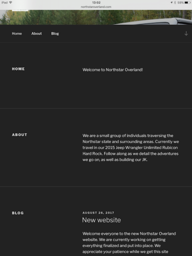
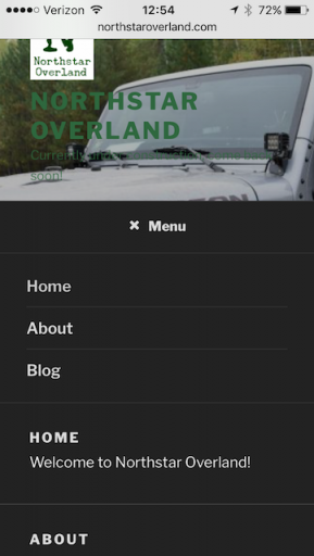
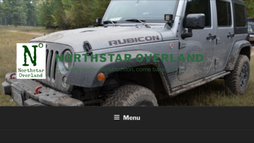
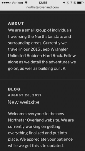
I would love to get some feedback from the Overland Bounders. I'm working on creating a new blog, and wanted to get some feedback as to what to change, add, etc. I've never created anything like this before so I'm completely lost. I would love your honest feedback.

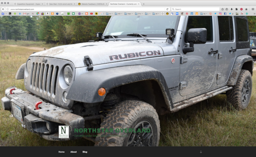
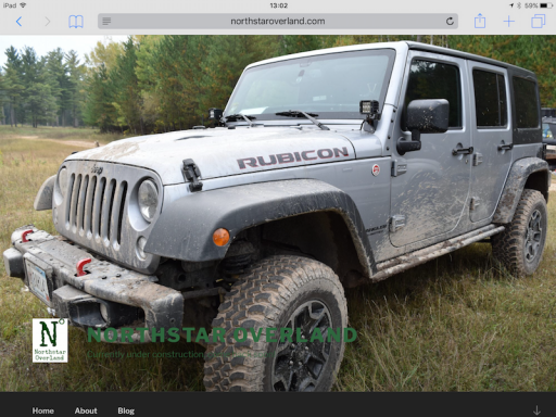
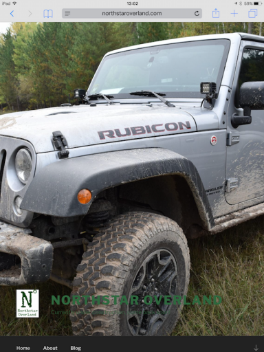
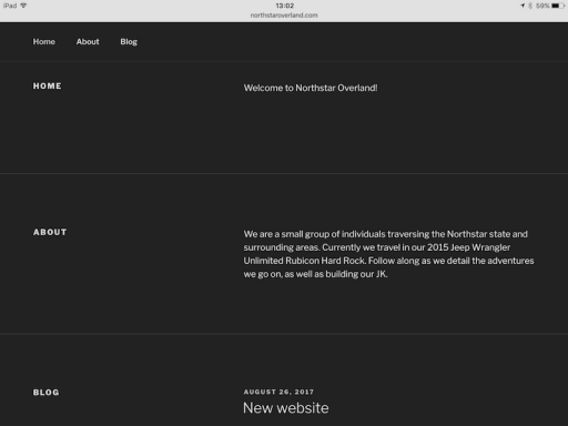
If you could go to www.northstaroverland.com and let me know what to change I would truly appreciate it.

Thanks again!

Also, moderators, if this shouldn't be here, let me know and move it to wherever appropriate. Thanks.
 
  • Like
Reactions: NC4RNNR

Steve

lost again...
Founder 500
Launch Member

Traveler III

4,312
Lorain County, OH, USA
First Name
Steve
Last Name
None
Member #

202

Glad to see that you're starting to document your adventures in a more permanent way that Insta and FB. This is something I plan at some point...

My two cents. I am viewing this on a 27" iMac using Safari. Other viewers may see something different:

Home page: The green text over the dark front page image is difficult to read. The Jeep image spills off the top, bottom, and right side at full screen. It just seems too large. Maybe a photo with it further away giving some context as to what's around it.

About page: It may be obvious in your area, but I have no idea what the Northstar state is in the description. "We are a small group of individuals traversing the Northstar state and surrounding areas."

General: It is likely a personal thing, or has to do with my aging eyes, but I won't bother to stay around and read a web site with light text on a dark background. It makes my eyes wonky. (Yea, I know that's what Overland Bound has, which is why I use the Xenforo default style of black text on a white background.) I know that light on dark is the trend, so don't change it on my account.

Overall, it looks like a clean, easy to navigate layout that needs a whole bunch of your stories and photos on it!
 
  • Like
Reactions: Road

toxicity_27

US MidWest Region Member Rep
Launch Member

Member II

3,278
Minnesota
Member #

0656

Thanks for the feedback Steve! I've been using a 22" monitor (old), with a 19" next to it, however I'll probably be converting over to a 32" spare tv for the time being. Then I may be able to see what you see. Thanks for the feedback on the colors too. I was looking at it and wasn't sure how I felt about it. I had white, but it seemed to bright. I'll have to look at it again.
 

Steve

lost again...
Founder 500
Launch Member

Traveler III

4,312
Lorain County, OH, USA
First Name
Steve
Last Name
None
Member #

202

Yep, white can be bright. I just turn down my screen brightness. I have a domain name but haven't started anything yet. That's where I parked my Road Shower review. I thought it look plain, so added a light khaki background instead of white, and like it a lot. That's the theme I'll eventually go with.

http://explore-the-usa.com/rs2/
 
  • Like
Reactions: toxicity_27
E

expeditionnorth

Guest
I would also add/create an youtube channel, folks love watching videos of others overlanding
you can never have too many ways to reach the audience
 

The other Sean

Rank V
Launch Member

Pathfinder I

2,271
Minneapolis
Member #

2292

Glad to see that you're starting to document your adventures in a more permanent way that Insta and FB. This is something I plan at some point...

My two cents. I am viewing this on a 27" iMac using Safari. Other viewers may see something different:

Home page: The green text over the dark front page image is difficult to read. The Jeep image spills off the top, bottom, and right side at full screen. It just seems too large. Maybe a photo with it further away giving some context as to what's around it.

About page: It may be obvious in your area, but I have no idea what the Northstar state is in the description. "We are a small group of individuals traversing the Northstar state and surrounding areas."

General: It is likely a personal thing, or has to do with my aging eyes, but I won't bother to stay around and read a web site with light text on a dark background. It makes my eyes wonky. (Yea, I know that's what Overland Bound has, which is why I use the Xenforo default style of black text on a white background.) I know that light on dark is the trend, so don't change it on my account.

Overall, it looks like a clean, easy to navigate layout that needs a whole bunch of your stories and photos on it!
I'll also agree with the text color.

And "the north star state" is one of the state of Minnesota's nicknames (it's official motto is Its official motto on the state seal is "L'Étoile du Nord" or translated to English as "Star of the north", so I see no problem in using it.
 
  • Like
Reactions: toxicity_27

Road

Not into ranks, titles or points.
Launch Member

Advocate III

3,379
On the road in North America
First Name
Road
Last Name
Dude
Member #

6589

15" Macbook Pro here, and if you need, can test it on iPad and iPhone later in the week. I agree with @Steve on the scrolling green text...I didn't even notice it' til I started clicking around and trying to scroll. Agree too about the image being rather huge; I could see a long section of that image being a page header, or a smaller image with the Jeep off to the right as if moving left into the image, and the outdoors scene to the left. Also, he's right, not everyone is going to instinctively know that Northstar state means MN. I wouldn't force them to go look. You want your site to be "sticky" not make them click elsewhere.

As you build your site, it's always wise to check multiple browsers and platforms to see how they all understand and parse your wordpress pages. Most wordpress themes take it into account, but not all. Not all wordpress themes translate to mobile as well as others, too, which is always a good thing to consider when switching themes.

Great start, though, and it will be fun to watch as you populate it with more content. I've owned roaddude.com for years (I own several others too, non-overland related) and after being waylaid caring for an elder family member for years, will finally be adding more content this year and making a main page, with the blog being a link instead of the front.

#OutfitandExplore! and add a mess of content before publishing it, then sort out how you want to tell your story.
 
  • Like
Reactions: toxicity_27

toxicity_27

US MidWest Region Member Rep
Launch Member

Member II

3,278
Minnesota
Member #

0656

15" Macbook Pro here, and if you need, can test it on iPad and iPhone later in the week. I agree with @Steve on the scrolling green text...I didn't even notice it' til I started clicking around and trying to scroll. Agree too about the image being rather huge; I could see a long section of that image being a page header, or a smaller image with the Jeep off to the right as if moving left into the image, and the outdoors scene to the left. Also, he's right, not everyone is going to instinctively know that Northstar state means MN. I wouldn't force them to go look. You want your site to be "sticky" not make them click elsewhere.

As you build your site, it's always wise to check multiple browsers and platforms to see how they all understand and parse your wordpress pages. Most wordpress themes take it into account, but not all. Not all wordpress themes translate to mobile as well as others, too, which is always a good thing to consider when switching themes.

Great start, though, and it will be fun to watch as you populate it with more content. I've owned roaddude.com for years (I own several others too, non-overland related) and after being waylaid caring for an elder family member for years, will finally be adding more content this year and making a main page, with the blog being a link instead of the front.

#OutfitandExplore! and add a mess of content before publishing it, then sort out how you want to tell your story.
I would appreciate it if you could test it on iPad and iPhone later. It's weird because on my end it seems to look fine as far as the picture goes. I'll definitely update the text and background color. I'm going to be working on content once I get most of it figured out.

I appreciate the feedback on the Northstar state part as well. As you said outside of Minnesota most people don't know it, and I don't want to make people have to look it up. I'll start working on the updates tonight after work. A

Keep the feedback coming!
 

Road

Not into ranks, titles or points.
Launch Member

Advocate III

3,379
On the road in North America
First Name
Road
Last Name
Dude
Member #

6589

Alright, went ahead and checked it out on both iPad Air2 and my iPhone 5s. If I don't do it now, I'll likely not get to it later ;) .
Here are actual full-screen caps from my Macbook Pro 15" and from different mobile devices in both vertical and horizontal.
All images show what your site presents upon first opening.

Macbook Pro, 15", OSX Yosemite w/res: 1680 x 1050, Firefox 54.0.1:
forNSOL-mbp15_2017-08-28 at 12.49.39.png

iPad Air2 iOS 10.3.3, Safari, horizontal:
iPadAir2_1326.PNG

iPad Air2 iOS 10.3.3, Safari, vertical:
iPadAir2_1327.PNG

iPad Air2 iOS 10.3.3, Safari, horizontal, text portion:
iPadAir2_1328.PNG

iPad Air2 iOS 10.3.3, Safari, vertical, text portion:
iPadAir2_1329.PNG

From iPhone 5s iOS 10.3.3, Safari:
iPhone5s_0025.PNG

From iPhone 5s iOS 10.3.3, Safari, (clicked on Menu):
iPhone5s_0026.PNG

From iPhone 5s iOS 10.3.3, Safari:
iPhone5s_0027.PNG

From iPhone 5s iOS 10.3.3, Safari, text portion:
iPhone5s_0028.PNG
 

Attachments

toxicity_27

US MidWest Region Member Rep
Launch Member

Member II

3,278
Minnesota
Member #

0656

Thank you! Looking at it again, the Green is difficult to read right up top. I'll probably look for a different image to use as well. I truly appreciate it @Road.
 
  • Like
Reactions: Road

toxicity_27

US MidWest Region Member Rep
Launch Member

Member II

3,278
Minnesota
Member #

0656

I did some updates. Are you guys thinking the top image should still be a bit smaller as I kind of am?
 
  • Like
Reactions: Steve

Steve

lost again...
Founder 500
Launch Member

Traveler III

4,312
Lorain County, OH, USA
First Name
Steve
Last Name
None
Member #

202

I like it! The top image shows the area you are traveling rather than focusing on only the Jeep. Everything else looks good, too. Now I know Minnesota is the North Star State! :)
 
  • Like
Reactions: toxicity_27

toxicity_27

US MidWest Region Member Rep
Launch Member

Member II

3,278
Minnesota
Member #

0656

I think this is basically how I'm going to leave it for now (maybe some tweaks down the road) Also still trying to come up with something to put under Northstar Overland instead of under construction.

Will be starting out the blog posts with some of the builds so that people can kind of follow along to see what's going on. Thoughts on this idea?
 

Steve

lost again...
Founder 500
Launch Member

Traveler III

4,312
Lorain County, OH, USA
First Name
Steve
Last Name
None
Member #

202

Thoughts on this idea?
That's why my site is empty; I don't know where to start@ :) Just listing the modifications doesn't seem like it would encourage folks to return, and I pretty much say all I want to say here and on Instagram, so I'm at a loss as to what to use my site for. It looks like you are at least a few steps further along, and have an idea as to what content you want to include.
 

toxicity_27

US MidWest Region Member Rep
Launch Member

Member II

3,278
Minnesota
Member #

0656

That's why my site is empty; I don't know where to start@ :) Just listing the modifications doesn't seem like it would encourage folks to return, and I pretty much say all I want to say here and on Instagram, so I'm at a loss as to what to use my site for. It looks like you are at least a few steps further along, and have an idea as to what content you want to include.
I don't post here as often as I used to, as this is something that I've wanted to do since I started. Seems easier to update in one place instead of several different forums, but who knows.

I'm thinking start out with build, and sprinkle in trips. I'd like to do GPS tracks etc, spread the word of overlanding, as well as create videos. I feel more lost on the videos.
 
  • Like
Reactions: Steve

toxicity_27

US MidWest Region Member Rep
Launch Member

Member II

3,278
Minnesota
Member #

0656

I think I've got it to where I like it for now. The next step is the content. I'm struggling a little bit with what I should do. I was thinking of starting out with a review, but I'm not sure that's how I want to start out.

For build progress I've essentially got 4 posts that I could do, maybe squeeze in another.

This is tougher than getting everything put together!